
Big visibility. Local impact.
Carson Digital Billboard launched with a powerful physical asset: a modern digital screen positioned at one of Carson City’s busiest intersections. What it didn’t yet have was a fully realized brand presence to match that scale.
Owned and operated by local leaders Charlie and Jo Kilpatrick, the business was built on a simple idea: bring major-market visibility to Carson City, but deliver it with hometown care. They needed a brand that felt as confident and visible as the screen itself, while staying grounded in community partnership.
MCBCreative was engaged to clarify the message, refine the identity, and build the foundational marketing tools required to move from “a billboard” to a trusted advertising partner.
Challenge
Carson Digital Billboard had strong operational advantages: prime intersection placement, guaranteed impressions, flexible scheduling, and responsive local ownership.
But the brand presentation did not yet communicate those strengths with clarity or consistency.
Key challenges included:
-
No fully defined brand identity system
-
Inconsistent messaging across materials
-
A website that lacked strong positioning and clear calls to action
-
Under-leveraged differentiators versus national advertising networks
-
Need to speak simultaneously to businesses and nonprofits
The opportunity was clear. The brand needed to feel as bold and visible as the screen itself, while reinforcing its local-first mission.
Solution
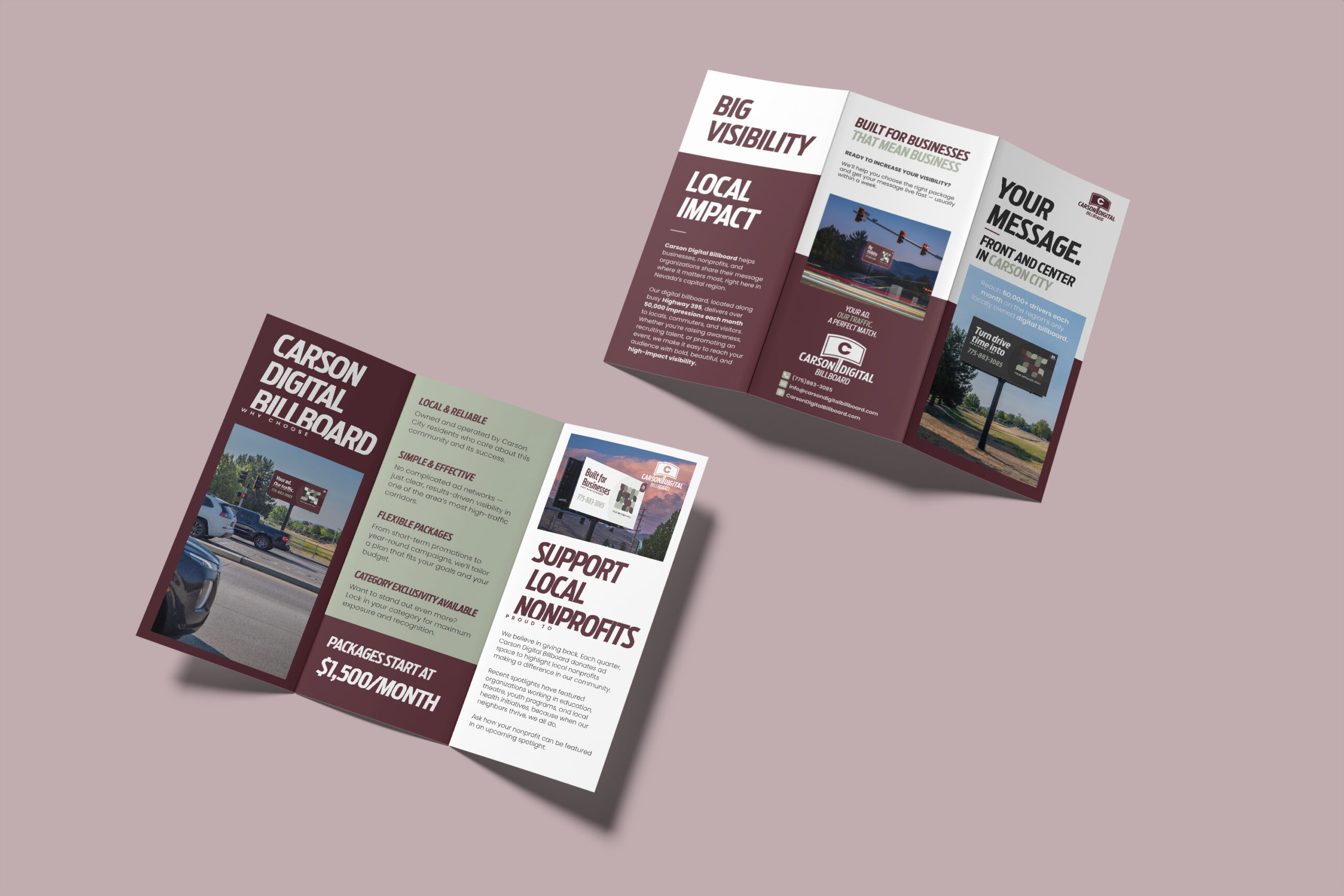
MCBCreative led a focused brand development process that included:
Brand Positioning & Messaging Framework
We clarified Carson Digital Billboard’s core value proposition:
-
Major-market visibility
-
Small-town partnership
-
Guaranteed impressions
-
Responsive, white-glove service
The brand voice was refined to reflect a professional yet neighborly tone, rooted in Carson City’s rhythm and community spirit.
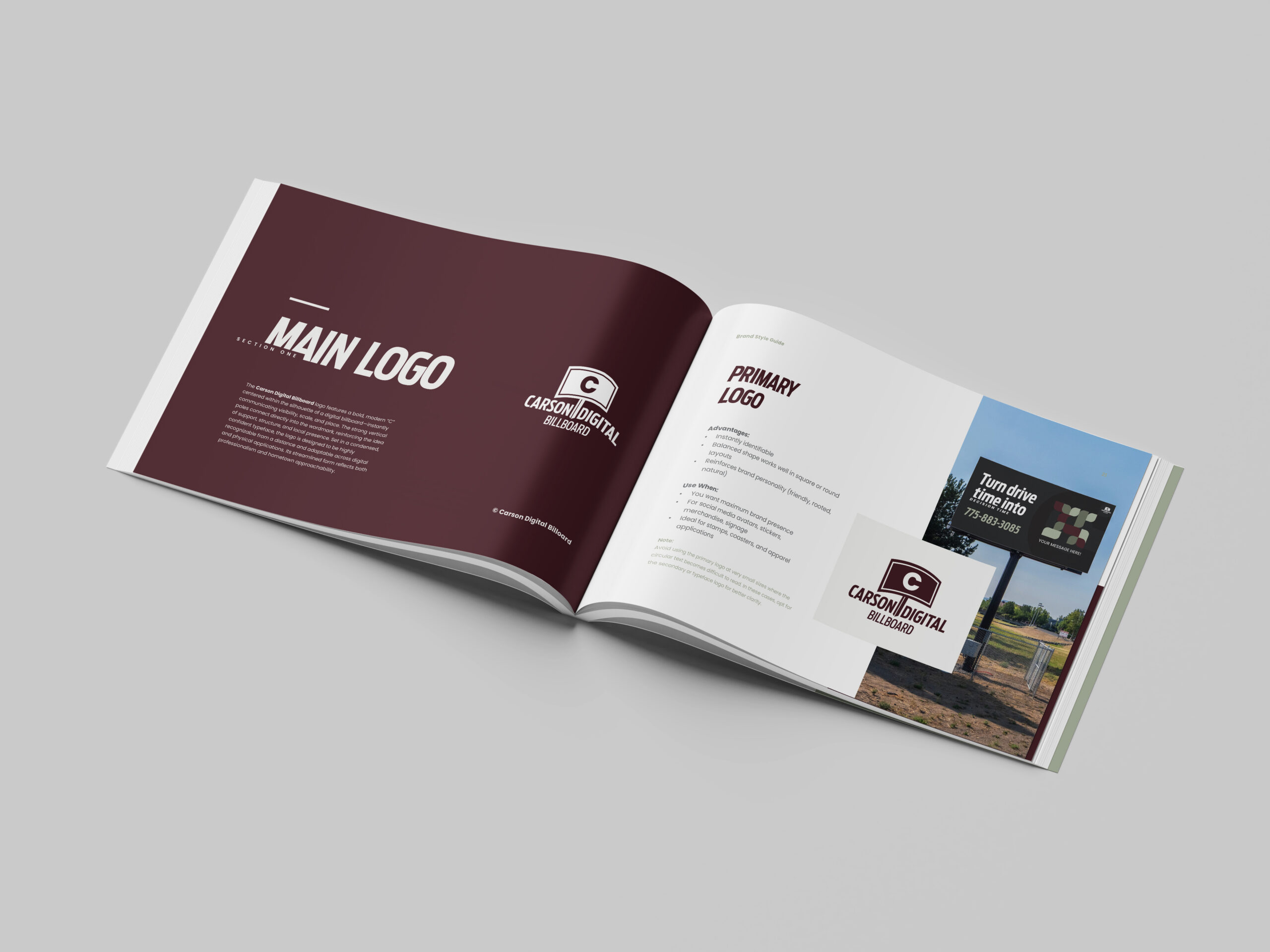
Visual Brand Identity System
We developed a complete visual standards guide, including:
-
Primary and secondary logo systems
-
Clear usage rules and spacing standards
-
A grounded, natural color palette
-
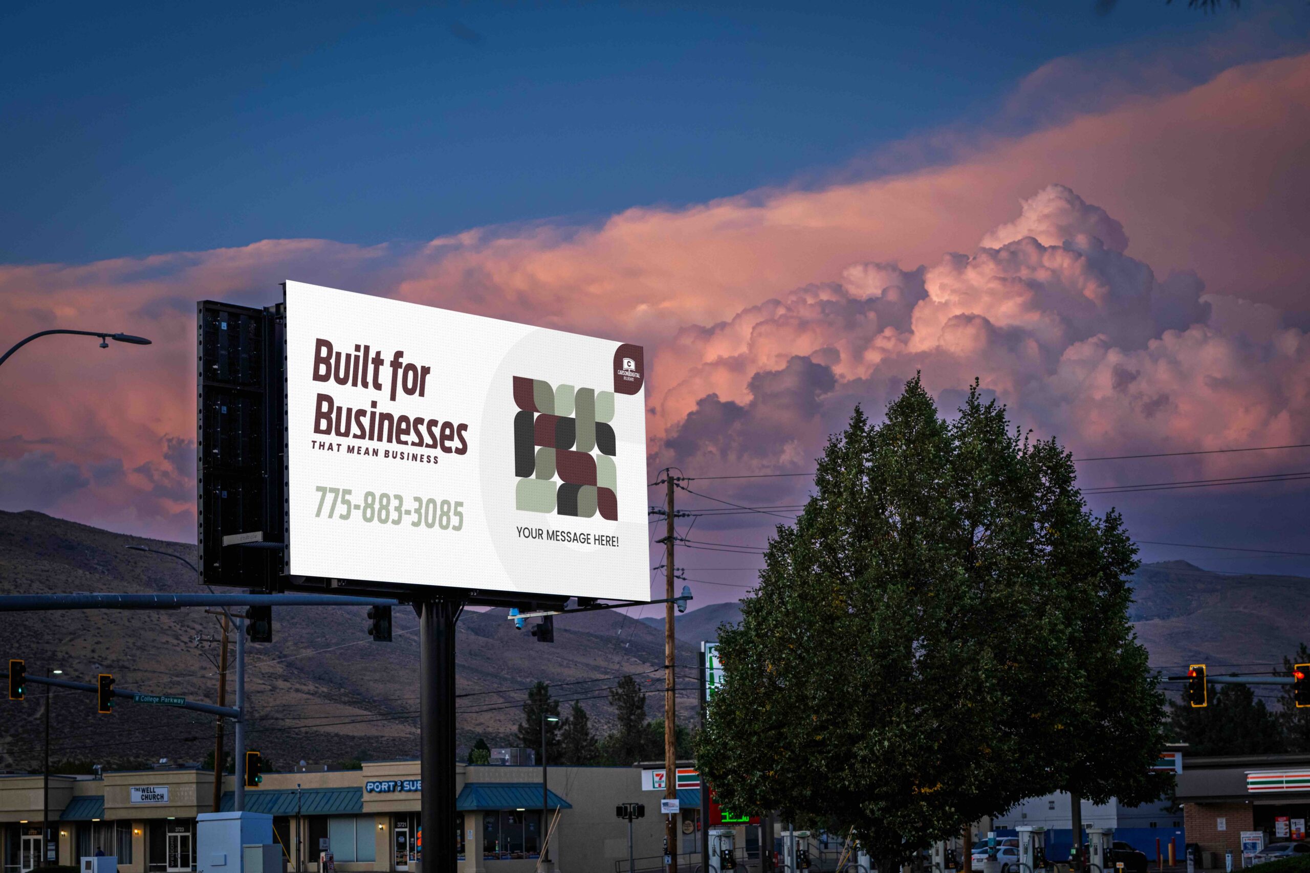
A bold, condensed headline typography system designed for distance legibility
-
Supporting brand pattern and stationery standards
This created a cohesive identity that works equally well on signage, digital platforms, and print collateral.
Website Content & Structure
We structured the website around clarity and conversion:
-
Strong homepage value proposition
-
Clear “Advertise With Us” pathway
-
Defined packages and ROI positioning
-
Community-focused Nonprofit Spotlight section
-
Streamlined contact and inquiry flow
The messaging shifted from descriptive to strategic. Instead of simply stating features, it communicated outcomes: visibility, relevance, and measurable local impact.
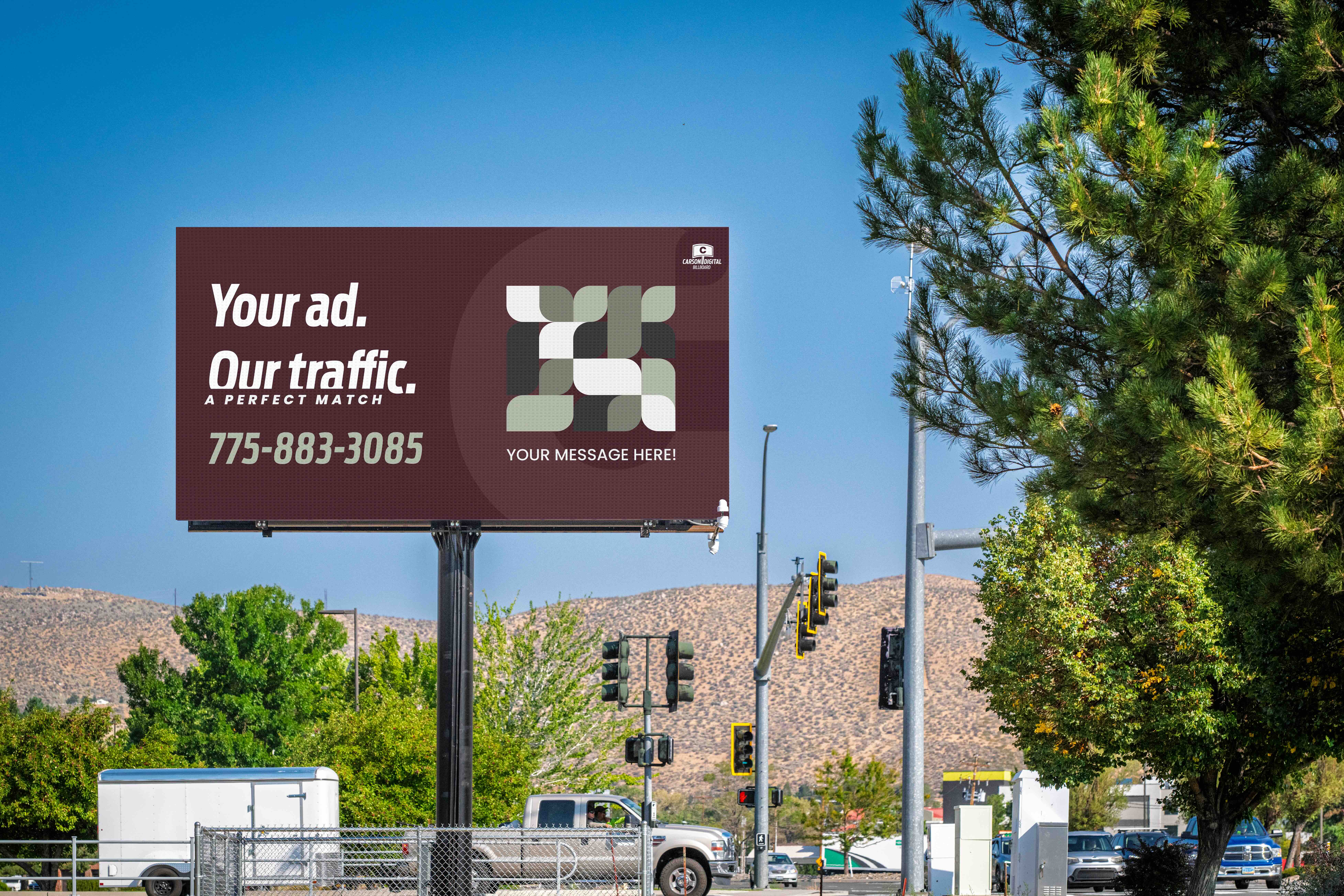
Brand Standards for Campaign Effectiveness
We built guardrails into the brand system to ensure billboard creative would perform in real-world driving conditions. This included:
Limiting word count per frame
Prioritizing high-contrast color combinations
Avoiding cluttered calls to action
Emphasizing bold, legible typography
This wasn’t just aesthetic refinement. It was performance-driven design.
Creative Services Provided
The Impact
Carson Digital Billboard now stands as more than a screen at an intersection.
It is positioned as:
-
A local growth partner
-
A champion for Carson City businesses
-
A platform for nonprofits
-
A measurable, cost-effective advertising solution
By aligning brand identity, messaging, and website experience, the business now communicates its value with clarity and authority.
This marketing matters because visibility fuels local economies. When businesses are seen, they hire. When nonprofits are seen, they fundraise. When local companies grow, communities stabilize and strengthen.
Carson Digital Billboard now has a brand presence that reflects that responsibility.
Big visibility. Local impact.

